Setting up Lights – Basic Shading
Inkscape tutorial
This has to be one of the most requested tutorials: it’s on basic shading and setting up lights. How do you do it? Why do it? Where do I add shadows and what colours do I use? Lighting is vast area and the possibilities are shear endless. In this tutorial I tried to cover the absolute basics with one of the simplest shapes – the ball.
If used correctly light and shadow will make your scene / object look a lot more spectacular, real and visually appealing.
Let’s start with a circle – I know this must be the 100s time I have written those words – but it’s still the easiest object to work from.

Basic Setup
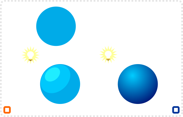
Start with a circle and a single colour fill.
Note:
It’s a pretty flat circle.
To give it some depth add a lighter duplicate and an even brighter one for the highlight.
To make it even more three dimensional you can use the gradient tool and choose radial gradient.
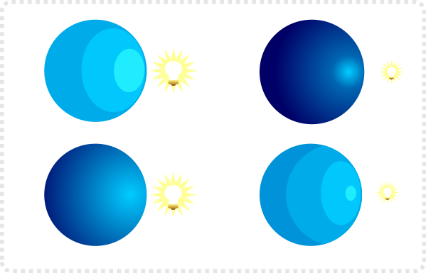
Changing the location of the light source means altering the position of the gradient’s center…
or in the case of the cell shaded ball – the positioning of the lighter shapes.
Less intense lights mean less highlight and more shadow on the shape.
You can use the same colours but alter the positions of the gradient controlers.
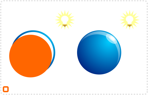
To achieve a more shiny effect rather than a dull surface, duplicate the circle, scale it down and duplicate
again. Use the 2nd circle to cut the white shape into a crescent. With some added transparency and two highlight we have a shine.
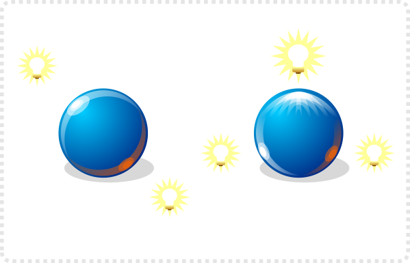
To add visual interest a lot of the time you will find a secondary light source with a different colour. It adds interest and enhances the reflective quality of the object.

Changing the light

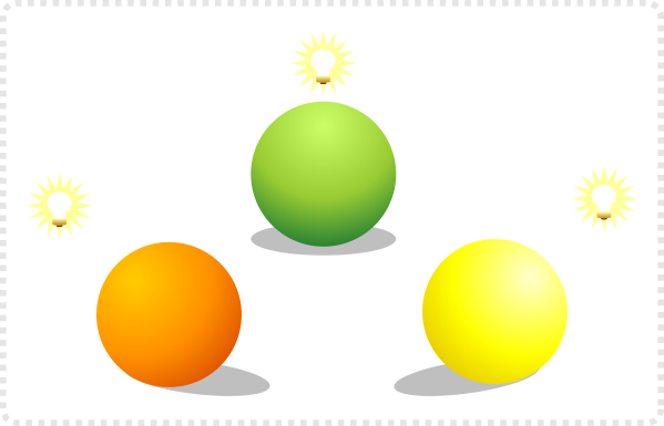
Along with the highlight the shadow changes according to the position of the light.
The shadow ‘grounds’ the object. It’s the connection to the surface it sits on.
Without the shadow the object looks like it’s floating and kind of suspended in space.
Create duplicate shapes and colour them dark purple. Set the opacity to 25% (either in the Fill & Stroke window or in the lower left next to the colour).
Alter the nodes to deform them. Turn the left and right nodes into corners.
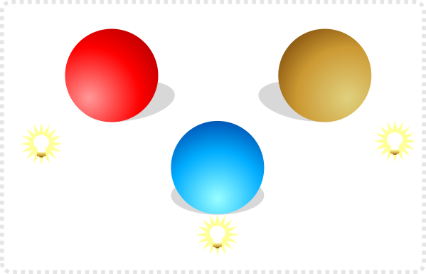
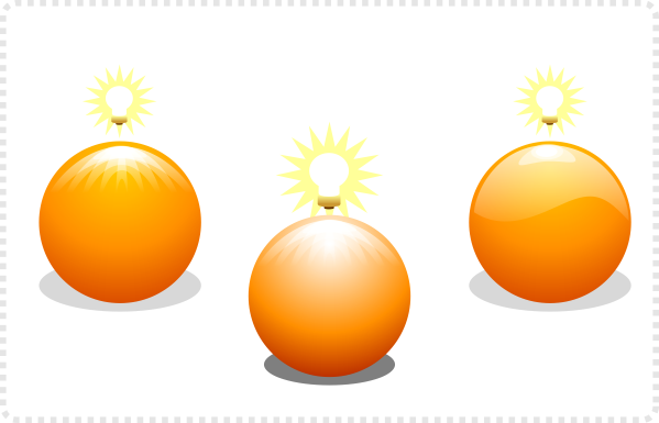
Try different variations of the highlights e.g. a sequence of crescents.
Different intensity of light can cause brighter highlights but also darker shadows.
A popular light effect is the ‘glass effect’ with a smooth alpha gradient on a shading shape (a smaller duplicate of the circle with a wave).
Colour

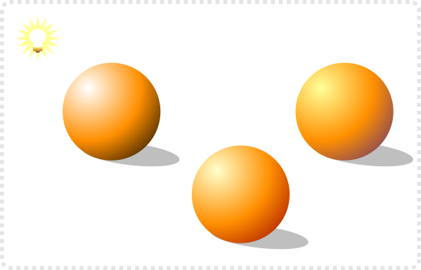
A white light with a black shadow colour looks very cold.
Turning the light into a very light yellow and the shadow colour into a dark red feels a lot warmer.
Here the yellow is darker and the shadow is a purple colour.
A bright light causes the object to appear lighter and shadow gets darker…
…while less light in a dark scene causes the gradient colours to be very similar.
The light can also also reflect the setting (e.g. late afternoon in autumn with a warm orange light)


To add to the complexity of lighting an object there is the indirect light. That’s the light that bounces off the surface of other objects e.g. the white table top.
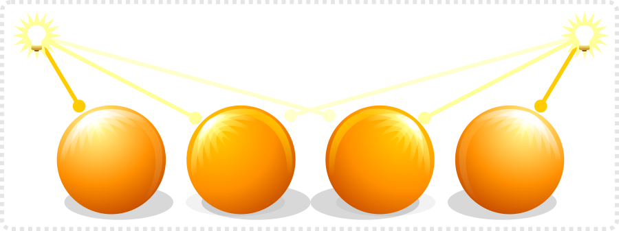
Using two light sources can make an object look more interesting…
as you add more light sources it becomes more confusing…
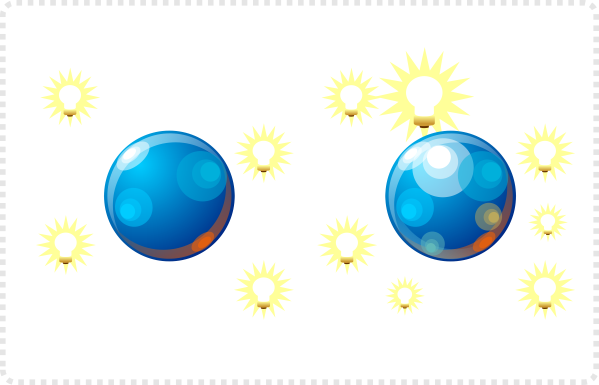
and finally just not visually ‘readable’ anymore.










Awesome, cheers!
You rock, as always. Thanks for your tutorials!
Nunca pensei que iria achar tutoriais tão simples de Inkscape.
Eu sou leito em edição vetorial mas por aqui já até consegui desenvolver um cartão.
Tenho planos de criar graficos novos para um jogo open source que jogo, continue com o belo trabalho!
Parabéns!
Thank you for the tutorials!
Hi, thank you very much for your amazing tutorials in this blog. I stopped game development because I did not know how to draw these stuff and this blog gave me a tremendous amount of hope :)
I have one request please, you know as a programmer we do not have that gift which allows us to draw something from scratch, or even imagine a concept. So we need a guide like a real photo. Could you please write a tutorial on how to vectorize/cartoonize an existing photo? like a real face, building, or a car like the one in this photo for example:
https://2.bp.blogspot.com/_J3_liDBfbvs/SwftYVxz45I/AAAAAAAAQMw/IsIkiQ3C5JU/s1600/2010-BMW-Z4-Side-View.jpg
In Adobe Illustrator when I 'Live Trace' it.. it creates TONS of paths and does not look good, does not look shiny/polished. I think I have to manually trace/sketch it but when I do so I get confused about how much paths I need to draw to give each one a different colour, how to colour it, how to finish it.. etc and I always end up with a shadow photo of it! Please help, thank you very much.
Look at this amazing VW :(
https://fc06.deviantart.net/fs44/f/2009/076/4/3/VW_DragBus_Destroyer_Carbon_by_M2M_design.jpg
How to make a one like it based on an existing ugly real raster photo as a guide?
Jad, the problem is the gradients – vectorizing tools can't understand gradients. They will go with similiar colours and shades and form a more or less complex object around them those. With the BMW Z4 for example it's a matter of defining the shapes manually – redrawing of them and then adding detail, shadows and highlight.
It would make a great tutorial… I will have a think about it for sure.
Thank you very much. I will keep trying tracing/drawing it manually while waiting your tutorial please, thanks for your reply.
As always, this tutorial is pure gold!