


Character Design
Review
I just had a friend send me his Inkscape character design and asking for my opinion.
Hadjoudj Mohamed did a good job for an initial design but there are a few easy to avoid beginner problems.
This tutorial is based on showing him how to improve, alter, and easily modify his character. A lot of the hints work with pretty much any character you create for an illustration or a game.


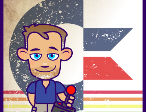
Let take a look at the character.
There is nice shading in the body and an overall consistent colour scheme.
The most striking elements are the hat, which looks too flat and the limbs, as they are very straight.
The proportions of the face make him look a little boring, due to being elongated with a lot of space between the eyes and the mouth.
Note:
Creating a triangle from both eyes to the center of the mouth. The smaller the height of the triangle the cuter the character appears.

Let’s simplify things and reduce them to silhouettes. Rather than lose yourself in details and shading, focus on the proportions and readability.
Ask yourself: Is your character creation recognizable in just black and white?
It‘s a lot easier to make changes when you just have the basic shapes to move around.
Scale, squeeze and bend them. Play with different setups before going into detail and working on shading and colouring.
Silhouette
I like to look at the shape of the design and not be distracted by all the detail, shading and eye candy. Can the pose hold up without the visual gloss? Is the spaceship design recognizable? Does that tree shape look interesting enough? The easiest way to group it all and colour it black. There is always the undo after you checked. :)


By using simple shapes you make it easier and faster on yourself.
For example, using strokes for limbs rather than create more rigid and harder to alter shape.
You can add the arm to the hand as a shape
or
you can make the arm just a curved line between two nodes.
Note:
If you want more pronounced legs and arms I would suggest breaking them apart at the joints in this early stage.
Create an upper and lower arm and the hand or an upper and lower leg with the foot for easier placement and scaling.


As the focus of this blog is on game art, animation is an essential part.
Keep the animation of your character in mind when you start designing.
This is the right time to plan the keyframes of the character. It will help you determine how to set up the parts.
Create extreme frames and get to know your character.
Is he still looking good when you move him out of the initial pose?

Posing your character
It’s tempting to do a character design in your favorite pose. Doing art for games most likely involves animations. Consequently, more than just one pose is needed. It’s helpful to try a few poses and possible angles before you go into too much detail. Will the character still look good in an extreme jump or run state? What would the getting killed look like?

Once you are happy with your shape, pose, and proportions, it’s time to add some initial colours.
No need to go into too much detail when you are still finding your ideal colour scheme. Grouping elements with identical colours and adding shadows and highlights with transparency makes it quicker to try different colours.
Note:
A lot of the time things are easier than they look.
When I take the top hat apart, it reveals a simple oval that is the base for all other elements.
Duplicate the oval, combine the two via Path/ Union and remove the central nodes to create the cylinder.
Move two nodes up and out to make the top.


The fastest way to create eyes for me is always to start with a circle.
Deforming the initial eye shapes four nodes is quick and easy and gives a lot of different options.
A frequent mistake is the copy and mirror of the eyes without adjusting the lights in the eyes.
Selecting the iris and the lights and mirror it again to avoid the ‘mirrored look’.

I hope you enjoyed this quick (and out of the planned order) tutorial. It’s unlike the usual posts. Nevertheless, you might take something from it for your own creations.


I really like your simple sense of art, great job as usual!
As for Hadjoudj Mohamed, that's pretty awesome :D
Nice tips. Thanks!
Really worth to read. Waiting for more posts like this. :)
Hey Chris, great post. In fact, it made me want to go back and read every single one of your past posts, and buy your tile tutorial guide :-)
Two questions that you might consider for a future post, to help clarify things for us non-artists: First: How do you address perspective in your art? For example your tiles are mostly top-down (although grass doesn't look that different from the top versus an angle), while a lot of your characters are from the front. Do you consciously select a viewing angle when starting a project, or does it just sort of naturally come to you. The other thing; could you cover hills/mountains at some point? I guess that follows from my first question, as they look a lot different from the front than from the top.
Anyway, it's been a great series so far! I had been using Photoshop Elements for game art, and I will probably do a lot of it in Inkscape after reading your blogs.
Hi David,thanks I am glad you like my ramblings…
As for the questions… The perspective usually derives from the gameplay (What makes most sense for the game?) and the budget/ timeline (How much time and money can be thrown at art?) 2D side on or top down being the fastest to create, 2 1/2D a little longer and full 3D pre-rendered or full 3D take longest – as you need to create the model, texture it, rig and then animate it. Saying that, 3D might make sense in 2D or 2 1/2D games to speed things up – e.g. when you need rotations of complex elements that are just quicker to create in 3D.
I did start on a tutorial for backgrounds, layering and depth in a scene. I could add mountains there… I will find it and complete it.
Think about combining the advantages of those two tools. Create elements in Inkscape, make variations and alterations there and then import the art (via a pdf) into Photoshop for sizing, effects and bitmap based touch ups.
Hey Chris,
I just wanted to say thank you for all the hard work that you put into this website! It was a great help to me when I was developing my game. I just released it recently enough on iOS and Android. The game art in it wasn't great until I came across this site.
Here's the final product in case you are interested in seeing it.
https://www.youtube.com/watch?v=YgT8MW6R45I
Thanks again!
Andrew
Thank you very much for those freebies, wish you best luck with your journey :)
It is very nice post according to my view and I will keep in touch with this place. Click here.
yEAH
WISH I could upload my before and after…from this blog post ;)
My hat came out more of a Fedora shape..lol (which is fine) I couldn't get that cylinder shape for some reason
and another variation is a old taxi cab driver hat =D
Really amazing artist! You are designing skills is so creative
For the Duplicating the oval, combining the two and removing the central nodes makes the cylinder part, use combine is not work, the central nodes doesn’t show up, but use union is working, central nodes will show up.
True… I edit the text. Thanks!