


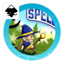
Creating a game title
Inkscape tutorial

If we break the image down, it consists of 3 elements the text (with an altered shape, highlights and shadows), the white background with an outline and finally some decoration on top. Let’s get started with the text.
Note:
The pointed shape makes the use of the more versatile path effect ‘lattice deformation’ not viable. For more rounded deformations – e.g. wavy shapes – it is an easier to use tool well worth checking out.


Start with the text you want to deform. Add the shape you aim for as a reference. Convert both it to a path – it will create a group.
Note:
As I want to add depth to the letters it is easier to use a bolder (fatter) font.
Stronger transformations also work better with non-serif fonts.
Ungroup the letters and combine them again with Path/ Union.
As Inkscape can only do an envelope with one curve on each of the 4 sides – I broke up the title into two parts – close to the middle.
In this case, GAME will be combined and TITLE will be another combined path.


Rather than apply an envelope via the Extensions/ Modify Path/ Envelope, which seems to have problems with curves and more complex shapes, I chose the Path Effects and added an Envelope Deformation to both sides of the title.
By enabling both top & bottom and left & right path deformation you can curve each half decently.
Inkscape will now show you 8 nodes at the ends of 4 lines. It really just is a 4 node deformation as the corner nodes work best when kept together closely.
Note:
The new path effects envelope is not ideal and I do hope that there will be a more complex envelope tool in the future. The splitting of the title is a workaround at best, an envelope shape with more nodes would be ideal.
Some tools e.g. CorelDraw offer a lot more flexibility with 8 or more nodes in the envelope shape along with helpful presets.
An envelope deformation is still not integrated in Affinity Designer.
Current feature
The envelope tool in Inkscape can be seen as work in progress. Compared to professional tools like Illustrator or CorelDraw, it requires working around the ‘shortcomings’ as far as the complexity of the shape goes or the usability when it comes to editing later one.
Note:
Some tools e.g. CorelDraw offer a lot more flexibility with 8 or more nodes in the envelope shape along with helpful presets.
An envelope deformation is still not integrated in Affinity Designer.


Align the words to the shape – this is just for helpful reference.
Scale the width of both parts a little to match the letters to the centre of the shape.
When selecting the edit-on-canvas button – in this case for the top bend path, two nodes and a green line will appear. Move the nodes to transform the text.
Note:
Inkscape will keep the line between the nodes straight until you click on it and drag it to convert it to a curve.


Create another duplicate and use ‘Path/ Inset’ ( CTRL+( ) for an inner shape.
Note:
Sometimes this approach gives a less than satisfactory result. The inner shape gets too big, rounded not exact.
You can use a stroke to create the inner shape as well.
Once you are happy with the deformation you can convert the elements to paths and make the deformation permanent.
This will also allow you to make changes to elements like the centre E and the T. The middle of the E got bent a bit too much and the top of T got too thick for my liking.

Line thickness
Play around with the line thickness – or even easier, set the stroke opacity to 50% to see exactly how far the inner shape cuts into your base text.

To create the outline, combine the two parts via Path/ Union ( CTRL + + ) to create one path – otherwise, the stroke of one side might overlap the other side.
Duplicate the path and create a stroke. In the stroke style panel click the top middle button in the order section to create a stroke behind the path.
Convert the stroke to a path via Path/ Stroke to path ( CTRL + ALT + C ) and bring the new path back with page down.
Add a thinner stroke to the path and give it a gradient fill.
Note:
I like to clean up extreme indents, steps or holes to make the outline shape look even.

Create another duplicate and use ‘Path/ Inset’ ( CTRL+( ) for an inner shape.
Note:
Sometimes this approach gives a less than satisfactory result. The inner shape gets too big, rounded not exact.
You can use a stroke to create the inner shape as well.
Create a thinner stroke. The stroke sits on the outer edge of the path, which means half of it is outside and half overlapping the inside of the path.
Convert the stroke to a path, break it apart via Path/ Break Apart ( CTRL + SHIFT + K ) to create two shapes. Delete the outer one and use the inner shape.

Inner shapes
Add some the light and a three-dimensional feel, using a copy of the shape inside.


Duplicate the inner shape and move it down a little bit.
Using Path / Difference ( CTRL + – ) cut the duplicate off the inner shape to create the ‚highlight shape‘.
Duplicate the title text shape twice and move one duplicate up a little.
Use the Path/ Difference again to create a ‚shadow shape‘.


Create gradient fills to 0% opacity for the highlight shape (top to bottom) and the shadow shape (bottom to top) and a colour gradient for the title text.
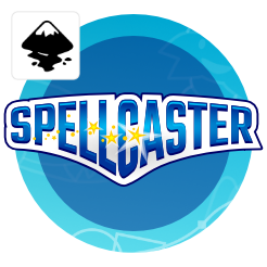
Finally, add some detail for visual interest – in this case, circles and stars.

Conclusion
I hope this answers the question about the creation of the last title/ logo and might give you some idea how to use this helpful tool for your next design. Use it on different elements – not just type – it works great on adjusting a design element to a rounded base (e.g. a batch on a character’s shoulder or a label on a barrel) or as deformer for a tree or scrub.


Amazing work Chris – it's always a pleasure to check your website and find new tutorial gems! Keep up the great work, TW
Thanks. I am glad you like my ramblings. I do enjoy writing them but need to force myself to make time for this sort of fun… :)
As usual… great work!
I have a question for you, Chris:
When aligning the title parts to fit the shape, do I have to do something to the shape too, in order to get that outline you displayed first towards the bottom? Just very curious…
Urie, no… The shape is just a helpful guide to see get the deform close to the desired result.