


Spaceship design
Feedback
This is a quick reply to a comment on the spaceship tutorials. I thought it might be helpful for others as well as it shows a lot of design issues encountered frequently when I am asked to give feedback.
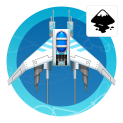
TheBootsie123 send me his design and asked for feedback and advice as it looked empty.

Main issues
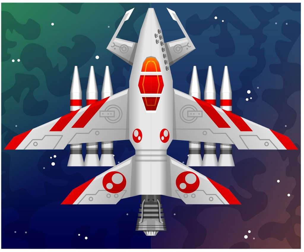
The main issue is the lack of contrast. A white background with a white ship is making not helping either. As a result, it’s hard to see the shape and distinguish the elements. The whole ship is very similar in colour with just a little bit of shading on the very edge. White is only ever really white when there is a bright light on it (or it is the light source itself). As soon as there is less light it will appear as various shades of grey.
Fixing
Rather than go for a base colour that is pure white I decided to go with a 10% black (a very light grey) and shade it 50% towards the edges of the ship. The wings got a linear gradient towards the outside.
I also tried to avoid too many straight vertical lines. It makes the design look less dynamic. I rather tried to set up an angle for the wings. This would repeat in the patterns (the red markings as well as the flaps).
Moving the rockets from the front towards the wing balances the design out better. Thus making neither the front nor the back too heavy.
Consistency
When scaling design parts keep things consistent. The stroke thickness and the details in line should be the same throughout the design. The earlier version of the back wing has the flap design scaled down. It looks cleaner when the elements of both the main and back wing are identical.
Adding markings or even wear and tear like scratches and burn marks will help add visual interest and realism.
In the final design, I did erase the ‘kill marks’ from the top. This was done to avoid a complete (and more boring) mirror image.
Flowing Lines
I tilted the design at the front inward. This will keep it in line with the angles of the wing design.
Adding more contrast will make the design more readable. This is of importance for the smaller scaled down versions that might be used in the game.

I hope this rundown of small changes to improve the design was helpful not only to the user sending the request. Keep the contrast strong and your level of detail consistent to make a more readable design that has more impact.


Thanks for the feedback on my spaceship! I'll use it all and try to make it better. As they always say, "Practice makes perfect"!