Aligning a text to a curve in Affinity Designer
Affinity Designer Tutorial
This is a quick tutorial on an easy and quick way to align a text along a curve for a vintage look. I had a browse through the answers I have given and illustrated in the past year and quite a few deserve more than just a reply to a post on a social media site. So, I decided to post some quick tutorials with just a few steps and some helpful hacks for both Affinity Designer and Inkscape.
Affinity Designer can align a text to a curve but it does so by changing the angles of the letters. Depending on the design and the font, this can lead to less than perfect results. In this case, the idea was an easy to read vintage label design with the text following a decorative swirl.
Let’s get started
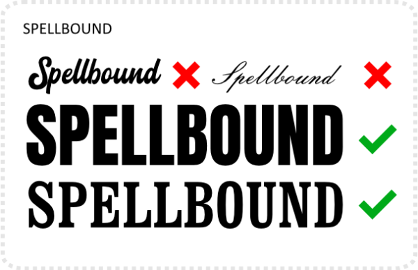
I start out with a text, assign a font to it with a clear separation of letters – preferably all capitals with similar heights.
Convert the letters to curves. This will create a group – separating each letter. Ungroup and you have each letter of the word as a separate vector curve.
Create the curve you want the text to flow along. I added a tapering with the pressure setting in the stroke panel. Extra swirls and curves add nicely to the design. Align the vertical position of the letters to match the curve.
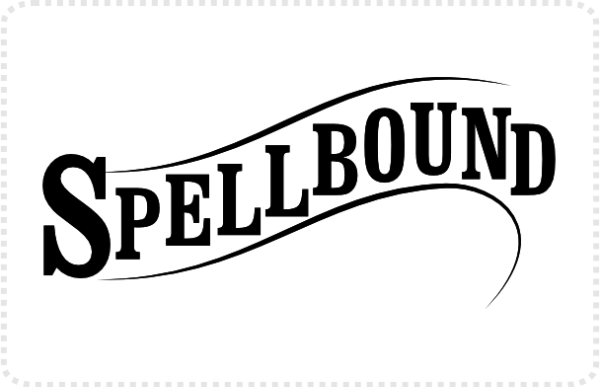
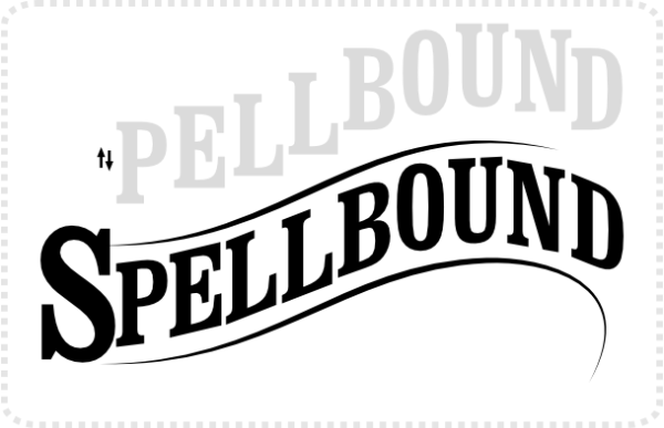
Click on each letter and use the shear tool [two arrows pointing in opposite directions] to adjust the angle of the letters to curve.
Give the text a bit more detail and that classic vintage look by adding a shadow below. Duplicate the letters for the shadow [or in this case, it’s two duplicates [one with the blend mode set to ‘erase’ and the transparent black one], and set them off vertically.
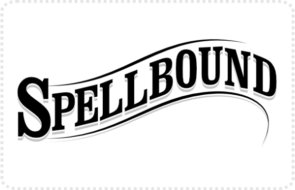
I hope this can be helpful, conjure some ideas, or just be informative. Enjoy!









I have never thought of that, and its so easy !
Nice !
Thanks, Esper. A lot of solutions are simple. Graphic design is hard enough as it is, no need to overcomplicate it further. :)