


Creating Elongated Text Effects in Affinity Designer
Affinity Designer Video Tutorial
This video tutorial on creating elongated text effects in Affinity Designer was [again] sparked by a social media post. There are a lot of ways to create this kind of effect. Usually, you convert the text to curves, pull down the nodes, and you are done. Alternatively, you add rectangles and merge them with the text. Neither option allows changes to the text after the conversion/ merge though. Yet, it is easily doable to keep it fully editable using symbols.
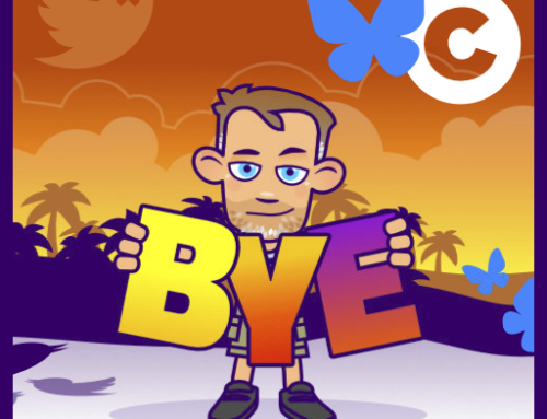
What we are after is something like this:

Using the elongated effect at the top and bottom
You can use the effect on the top as well as the bottom. Just make sure you use the top part of the letters when creating the rectangle. This will not work with a lot of fonts though – pick the right ‘very blocky’ font when attempting it.

Separating the text in the middle
An interesting alternative is a ‘spacing out’ of the middle part of the lettering. This variation is a lot harder to read though but can use striking when done right with ‘some action’ happening inside the word.

Placing a design/ photo inside the text
Seeing you have [at least] two objects – the text and the stretched rectangle(s) – using a clipping mask for a design inside the text is not really an option (unless you convert to curves and lose editability). But, using the ‘Mask to below’ (with a duplicate group of the text) works fine.

I hope you enjoyed this quick video tutorial on Creating Elongated Text Effects in Affinity Designer. Please like the video, subscribe to my channel and leave a comment to let me know what you would like to see.
It’s easy to modify and play around with as long as you choose your font right. You want a font with a clean baseline [either serif or non-serif]. Handwritten or decorative fonts make it a lot harder. You can try moving the duplicated rectangle of the symbol up further to create a straight baseline.
Note:
Interestingly, the way the human eye is trained, the top half of the writing is more important. It’s usually enough for us to see the top half of the letters to read a text.
Enjoy and have fun!