Designing a wizard for a logo
Affinity Designer Tutorial
A member of a social media group asked me for some help with a logo he was working on for a welder. Thomas Bloem‘s initial design had a wizard (Merlin) holding a welding torch and wearing welding goggles.
Here’s the design:
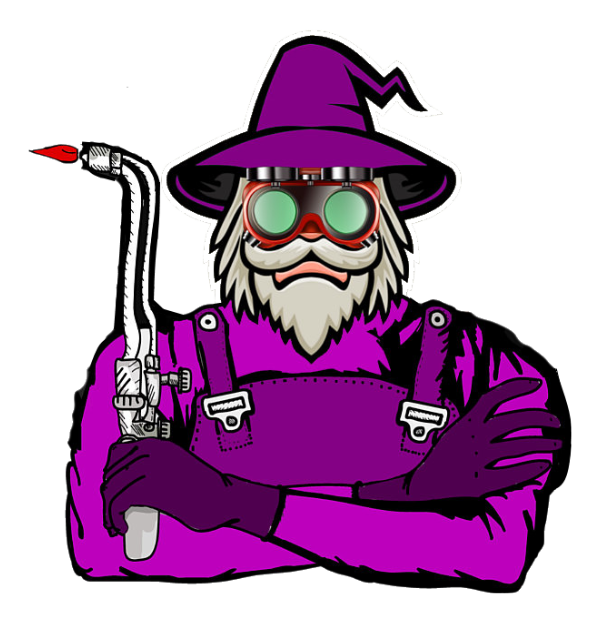
This design has a few problems. The fact that it is a bitmap image makes it problematic to scale, the level of complexity made it hard to read at a glance, the different styles in the design ranging from clip art to hand-drawn leave it looking inconsistent.
In my opinion, a logo should be clear, memorable, readable at a glance, and match the client, the business, and the industry. A logo for an ice cream parlor looks and feels very different from a game developer or a fishmonger or a car dealer. The colours, font choices, and design styles should match the expectations of the client as well as the audience.
Let’s simplify:

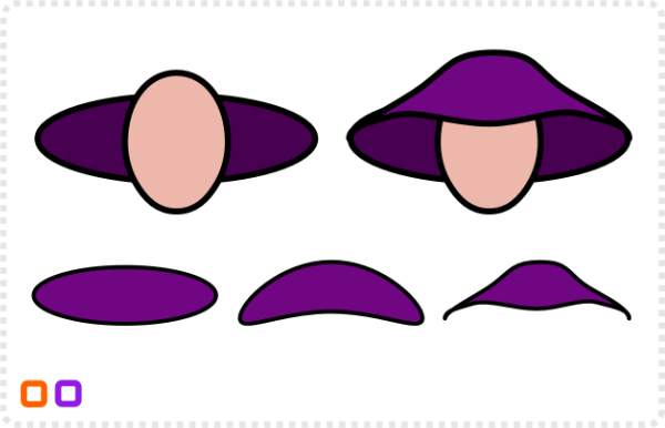
Start with the basic shapes: two circles for the head and the hat.
A third circle gets converted to curves, with added nodes serves as the front part of the hat.
I created the beard as a half that gets mirrored later. Using the pen tool create a straight line [holding down SHIFT] and create a rough shape with a straight line.
Refine it with the node tool by adding more nodes and curving part of the shape.
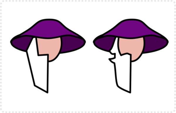
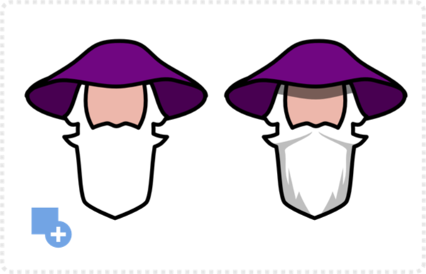
Duplicate the beard and mirror it. Combine the two halves with the Boolean ‘Add’.
Using the pen tool I created some shadow shapes for the beard [again doing just one side and mirroring it] .
A rectangle serves as the base for the top part of the hat. Rounding the top corners, converting it to curves, and then adjusting the curves with the node tool.
A simple triangle done with the pen tool gets some extra nodes and is added to the base shape.
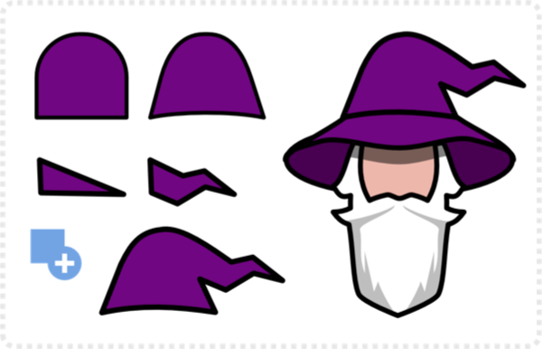

A bit more detail
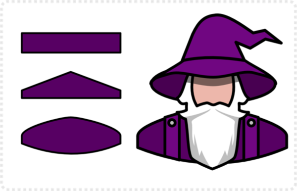
The shoulders and chest part is based on a rectangle, deformed and refined with some additional shapes.
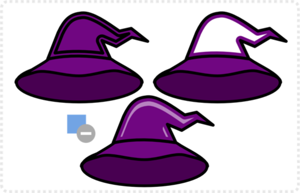
Using the contour tool, I created a smaller shape of the hat’s top for a tiny bit of shading. Bake the appearance, duplicate and offset the shape, and subtract.
Set to 50% transparency for a bit of added detail.
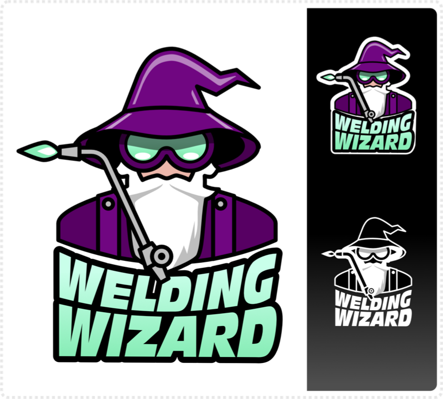
In the next step, I added the name underneath. Seeing Affinity Designer is still missing that feature in the current version, I did use an external tool for the text deformation.
Note:
I used CorelDraw – seeing I own an older version and have used CorelDraw for years and years prior to Affinity Designer – but Inkscape and Vectorstyler do the job as well – and they are both free.
Finally, I created the props to match [welding torch – made up of a line, stroke expanded and some circles – and the goggles – two circles, combined, added contour and some detail].
To me, the key is a consistent level of detail. Ultimately, for a logo like this reduction is more important than detail. E.g. there is no point in adding the hands or more facial features, as they don’t make the design clearer – just more complex.
When designing a logo/ illustration for a logo keep things simple and make sure the logo can be used for more than the client initially asked – as most clients don’t know what they want at the start of the project. Keeping things in vectors and scalable, making sure it works in a small version as well as enlarged on a T-Shirt or billboard will save you a lot of headaches down the road.
I hope this little tutorial was interesting and helpful. Have fun with your creations, as it will show in the design!
