Designing Text Effects in Affinity Designer
Affinity Designer Video Tutorial
This video tutorial on designing text effects in Affinity Designer was inspired by a social media post. The majority of the responders to the post dismissed the notion of creating something like this in Affinity Designer. It couldn’t be done like this. After all, the reference was a set of Adobe Illustrator styles.
I didn’t think it could be done as a style, as a style doesn’t allow copies of the same object within its setup. Yet, it looked achievable with some tweaking, use of the compound function, and a few effects.
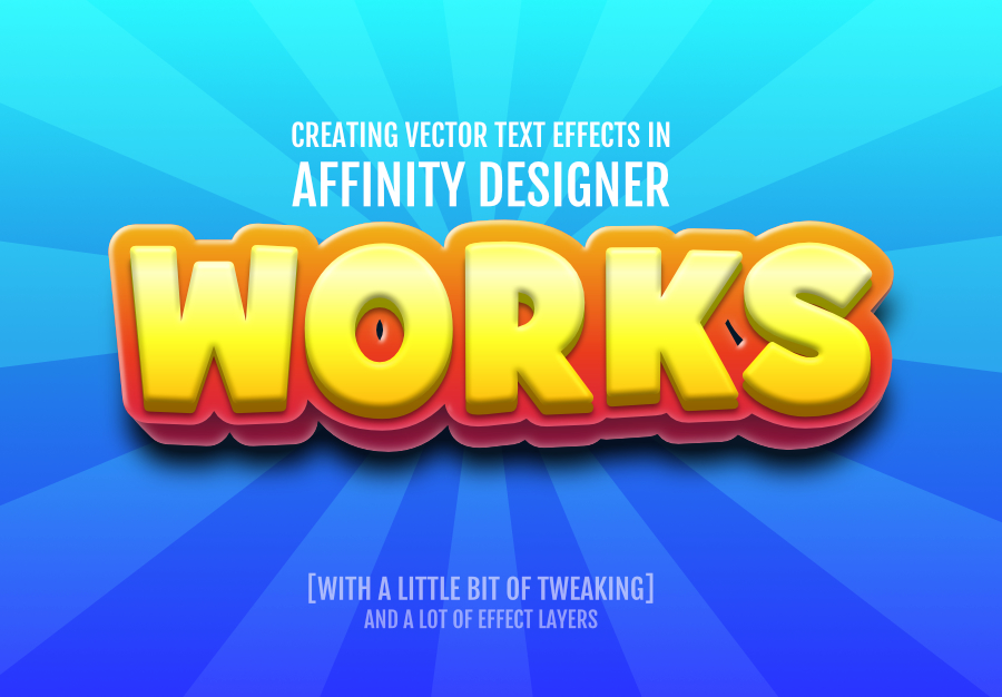
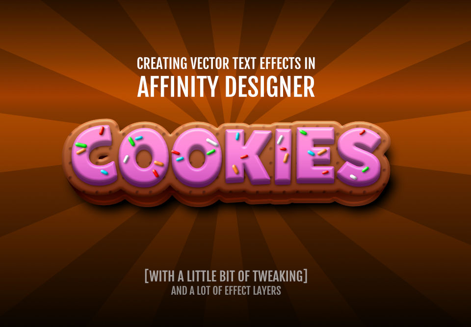
What we are after is something like this:


Tools used to design the texture effects
Besides the initial Artistic Text, I am mainly working with the Gaussian Blur on simple shapes and tapered lines. I am placing objects in clips to help constrain the elements inside. This is especially important when using effects like a blur. The edges of the blur [or drop shadow for that matter] might not be visible to the eye – as the outer rims are nearly fully transparent. Yet, the size of the resulting object might cause problems or show in print.

I hope you enjoyed this video tutorial on Designing Text Effects in Affinity Designer. Please like the video, subscribe to my channel and leave a comment to let me know what you would like to see.
It’s easy to modify and play around with these effects. Alter the colours, use cool gradients and effects. Just keep in mind that short words and bold fonts work better and make the creation process a lot easier. Choosing your font right is the foundation to a nice and clean design.
Find your style and most of all have fun doing it!


