


Adding more detail to your buildings
Inkscape
After a more stylized and outlined approach in the last tutorial (Building 2D game art houses the quick and easy way), I am going to refine a house this time. Adding more detail and more depth can be easy.
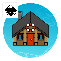
Starting with one of the variations of the last tutorial, the log building with the yellow roof will get a make-over. The idea is to reuse the existing elements as much as possible and add to them to make it look more interesting.


For a more detailed look of the buildings, let’s start by removing the stroke.
I took the log buildings with the straw roof from the previous tutorial.
I altered the colours to be a little less saturated and moved the two rectangles forming the front down a bit more to form a thicker roof.
Add another rounded edge rectangle/ pill shape element to create some detail and an uneven edge.
Duplicate and mirror details from the left and colour them darker for the right side.


Duplicate the frontal element twice and move one new shape down.
Using the Path/ Subtract [CTRL + -] create the shadow shape from the roof. Colour it e.g. in a dark brown with 50% opacity.
A line with a thicker dark and one with a lighter brown stroke placed right underneath each other form the planks.
The pillars get some rounded edges after converting the rectangles to paths.
Give it a dark brown matching the frontal planks. Two lighter and slimmer duplicates give the beams some volume.
Lower them [Pagedown] to be on top of the frontal and below the shadow shape.


The door will get a gradient colouring, a small window made from two squares, with two rectangles for the cross. A circle with its duplicate makes the doorknob and a wiggly line set to 50% opacity makes a wood pattern.
A rectangle at the top for shadow and 4 small shapes for highlights on the window frame finish off a more detailed door.
The window also gets a gradient with a lighter colour at the base. Add a smaller rectangle inside for the glass and two more for the frame.
A highlight on the frame and a shadow shape underneath complete the basic window.
Adding details and variations make the buildings more interesting.


Note:
The wood effect is explained in the tutorial I wrote a while back (Making materials: wood).
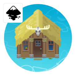
Added details
Ropes are simple lines with thicker strokes and little ovals for highlights. The skull is a combination of circles. There’s the head, 2 deformed ellipses for the lower part, 2 dark and 2 lighter skewed circles for the eyes. A triangle forms the top and a straight line with a curve at the end and a thick stroke, duplicated and scaled down twice before being mirrored the antlers.
Benefits
The ease to customize is the key element. Rather than use the yellow roof, here are two samples with minor alterations. Their look and feel is quite different.


thanks a lot
+1
That's why this blog is one of my favorites.
They looked great before, but now they look even better with the added details and without the outlines!
Thanks, Duke!
That's the thing with vector art, it's so easy to start and create something good and then go in an polish at a later stage and take it to the next level.
Thanks Chris, do you plan to have more tutorial on buildings, like shopping mall, cooperate building and cafe/food/restaurant?