


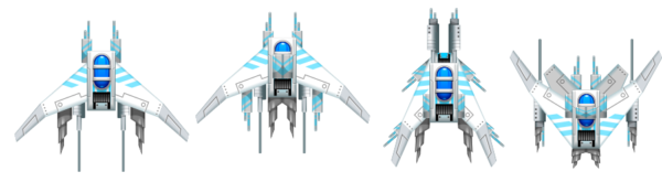
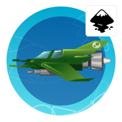
Space Ships
Texturing
The next step in the creation process is the shading. Let’s start giving the silhouette some volume, defining the layers of the ship (which parts are on top of others, which ones cast shadows, which ones get light, etc.).


Let’s pick an interesting design that shows some potential as a unique design.
By colouring the shapes and assigning a stroke we can see the shapes more clearly.
Before starting to shade, let’s add the cockpit with some rounded rectangles.
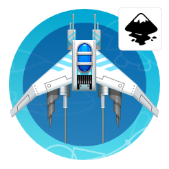
In order to speed things up, focus on one side.
Let’s delete one half.
Starting with the wing, add a base colour that will carry through the design of the ship.
Duplicate the wing parts and scale them down by moving the nodes inward.


Select the smaller and larger wing shape and use the interpolate extension to create the shading.
(Extension/ Generate from Path/ Interpolate)
The higher the step count the smoother the ‘gradient’.
When setting the step count, keep the size of the object in mind – too many steps make it overly complex.
By ticking the ‘Duplicate endpaths’ you keep the original shapes and get a group of shapes on top.
Interpolating the style will allow the colour and the strokes to change between the shapes.
The live preview will show the result even before you click on apply.

Interpolate Extension
You can also go wild by interpolating totally different shapes for some rather interesting results.

The more complex your shapes are the more chaotic the interpolation will turn out. Play with the extension and see what happens.
Let’s head back to our space ship design (before I get off track completely and start writing about something different altogether).


Using the circle tool and the straight line tool add some decoration on the wing.
Colour the stroke and fill in a shade darker than the wing and create a duplicate in a lighter colour that is set off a little to create some depth. Move the nodes in to stay within the wing’s main shape.
Create a rectangle and some duplicates as deco-ration on the wing. Adjust colour and opacity.
Group the wing and place it back on the ship.
One element done – a few more to go….
Repeating the same action with the other shapes to give them some volume.


Elements that are further down are shaded darker to give the design depth and contrast.
Adding more steps to larger shapes like the base and the glass cover of the cockpits ensures smoothness.
Leaving the base a little darker allows highlights to show up better once added.
Moving the highlights to the very top of the shape and adding 3 rectangles for more highlights.

Building an asset library
Creating these assets keep in mind that you can reuse elements that look good for other ships later on. I like to keep those elements in a separate document or a designated area on the page for easy ‘copying and pasting’.

Three more rectangles behind the cockpit will add some decoration.
Shaded rectangles bring some more detail to the shape.
Duplication the rounded rectangle of the frame the rectangle of the decorative element.
Coloured black with 50% opacity they create shadows to give those elements depth.
A rounded rectangle in the centre of the cockpit adds light to the shape.
Two duplicates shapes, squeezed to slimmer lines and bend inwards at the top create additional lights.


Add circles at the top and bottom of the blue shape and rectangles on the decor element for more highlights.
Using the straight line tool create some narrow pattern for the sides.
Duplicate the frame of the cockpit twice and offset one shape. Via path/ difference cut them into a sickle shape.
Shade the top shape lighter and the bottom shape darker.
Three rectangles with a gradient shading add more decoration and tie the cockpit block to the wing.


Group the cockpit element und bring it back into place with the other shapes.
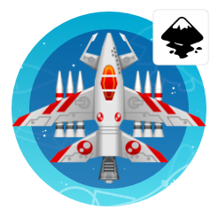
For a quick preview copy the ship’s shape and mirror them.
Building an asset library
Creating these assets keep in mind that you can reuse elements that look good for other ships later on. I like to keep those elements in a separate document or a designated area on the page for easy ‘copying and pasting’.
It’s time for a little fast forward as it’s getting late and the next steps are pretty much repetitions of the work on the cockpit.
I added a lot more transparent rectangles (with plain or gradient opacity) to add more highlight and shadow.


interesting tutorial !
i was expecting the shading is done with gradients
but obviously the method with interpolation is easier on the processor
sadly i must say the first part is not very clear in illustrating the method
the shaded part is hardly visible and then the tutorial gets lost in elaborating what interpolation can do with shapes (i found that part confusing as the tut is called shading)
Good point,, Espermaschine. I will look at the tutorial again tonight and might split it into a shading – more in depth and a decoration section with a small tutorial on the interpolation as a separate entry.
Tnx for the tutorial but its so difficult to do it.A video tuto will be more interesting. PLZ and tnx again :)
Thanks for the great trick Chris! Interpolate in this manner is exactly what I have been looking for, I never even considered using it for layered items to create a gradient!
I did not find the explanation difficult to follow, if you open up your Inkscape and try the steps on some random shapes you get it working pretty quick.
I will point out two things that tripped me up for a second since I tried it using shapes first:
1. There is a reason it under "generate from path", it only works if both shapes have been converted to paths using Path-Object_To_Path.
2. Both parts need to be different colors or different shades of same color (I only add this idiocy because I followed your tutorial word for word and since you never say change second wings color I didn't the first go around and interpolation is invisible :))
Thanks, I will rework this post / tutorial and will make sure to add your points.
I am not a big fan of video tutorials – I find most of them useless as I tend to just need one small hint [not the 20 minutes around it] and then usually miss the crucial bit.
Saying that, I will give video a try and see if I can get something decent across as a lot of readers did request it in the past. It just comes down to time, me learning to make a good video and the question whether or not it will be more helpful.
I really like your works here. what you do here is more than arts and i hope you will allowed for me to use some of your work in my game ((if i could make a game ^^)).
Sure… that's what the blog is about… Enabling you to create the artwork for your own game.
Wow, that's really cool..
Where you learn art for game programming?
I am self-taught. I started doing game art on a c64 before there was any proper training to teach you the skills… and I just kept on going… :)
This comment has been removed by the author.
Thumbs UP :D
Thanks for this tutorial! I just made my first ship for my space shooter game, and I am *so* happy with how it turned out! I ran into the same issues that TheRedAxe did, and I didn't think to check comments until now, but I was able to figure out the color issue from the pictures, and the first one from it being in the Path menu. :)
The other issue I ran into (in case it helps someone else) is that you have to turn off the stroke before interpolating. :)
Anyway, thank you so much! I'm a programmer, and I'm trying to teach myself some of the graphics/art side, and this was the most helpful tutorial I have found!
Hi. Thanks so much for the tutorial! I am however running into a little creativity block. I creating most of my space ship although It looks empty and I'm not sure what else to put. Could you give me some suggestions? Here's what it looks like so far. https://prntscr.com/fuhmr1
Hi… I took your design and made a quick makeover and posted it on the blog. I hope the added info and the reference is helpful.
Wow, dude. Thanks for sharing. I learned a lot!
Yes I've spent all day trying to make my wing look shaded like yours but my computer doesn't woek the same apparently. When I select the bigger & smaller wings on the one side & try to interpolate, using exactly same parameters as in your scrn shots, I get a variety of different results, none of which result in anything remotely resembling yours or any kind of shading whatsoever. There's GOT to be something you left out, something smart people already know perhaps…? I'm at my whit's end please give me some kind of hint – maybe expand on the interpolation part as if you're talking to someone that doesn't already know how to do it.